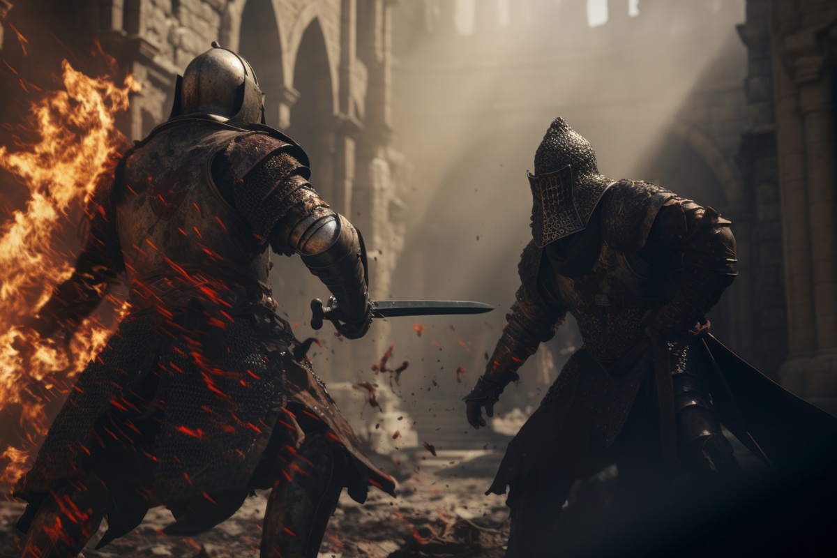
Picture a 12th-century battlefield: hundreds of knights in identical full-face helms, mail coats, and surcoats, all moving in organized chaos. Without a way to tell ally from enemy, medieval commanders faced a problem that would accidentally spark one of history’s most enduring visual languages.
When armor became the enemy of identification
The 11th-century Norman shield, shaped like a teardrop and tall enough to protect a mounted knight from shoulder to knee, needed no markings. Warriors could still see each other’s faces. But as helmets evolved through the 12th century into full-face heaumes with narrow eye slits, recognition became nearly impossible.
A lord could ride past his own king without knowing it. Two knights could charge each other in error, or let an enemy slip past thinking he was a comrade. Represented on the Bayeux Tapestry, the Norman teardrop shield was a marvel of practicality. It could even be driven into the ground to form a temporary palisade. But it told you nothing about who was holding it.
The solution was almost absurdly simple: paint something on it. A distinctive symbol, a color scheme, a pattern. Something readable at distance, at speed, in chaos.
The science born from military urgency
By the late 12th century, these painted marks had evolved from individual improvisation into a structured system. Specialists emerged who could read and record the symbols: the herauts d’armes, or heralds. Before and after battles, they walked the lines identifying allies and enemies, living and dead, by the markings on their shields and surcoats.
Heraldry was not an art project. It was military intelligence. A herald who misidentified a captured noble could cost his lord a substantial ransom. One who correctly read an enemy’s blazon at the moment of defeat could secure a fortune.
The rules grew complex, specific, and codified: colors (tinctures) chosen to contrast sharply for visibility, geometric patterns (ordinaries), animals and objects (charges), each with precise names in Anglo-Norman French. By the 13th century, heraldry had its own vocabulary, its own specialists, and its own law.
A system so important it renamed an entire social rank
The centrality of the shield to knightly identity is embedded in a word still used today: squire.
The Latin term was scutarius, the man who carried the scutum, or shield. An écuyer in French, a squire in English. Before a young nobleman earned his spurs, his most important duty was safeguarding his lord’s shield. Not his sword. Not his horse. His shield.
This was not ceremonial. In the chaos of a dismounted melee, a lost or damaged shield could be fatal. The squire’s job was to ensure the knight always had a recognizable, functional shield ready.
The shield shrank; heraldry didn’t
As armor technology improved through the 13th and 14th centuries, shields shrank. Once full plate could protect the legs on its own, the great teardrop became unnecessary. Shields became smaller, triangular, chest-sized. By 1260, the écu was already retreating.
But heraldry kept expanding. The symbols that started on shields migrated to banners, surcoats, helmets, horse caparisons, castle gates, seals, and eventually to stone carving and stained glass windows. A family’s visual identity, originally designed to survive a battle, became the language of lineage, alliance, and political authority.
Even the pavois, the great rectangular infantry shield used by 14th and 15th-century crossbowmen as a portable screen during the slow reload of their weapons, carried painted insignia. Propped in the ground to shelter a crossbowman as he cranked his weapon, this purely functional object was still marked. The system had become too important to stop.
The accidental inheritance
Heraldry outlasted plate armor by centuries. Family crests still appear on signet rings, university seals, and notepaper. National flags retain the geometric logic and high-contrast color rules first codified for battlefield visibility. Corporate logos, whether their designers know it or not, follow the same visual hierarchy: distinctive, readable at distance, instantly recognizable.
It all started because a group of 12th-century knights could no longer see each other’s faces, and someone thought to pick up a paintbrush.